Why Your Audio Medium Needs a Visual Component (And 3 Tips to Create One)
Many podcasters and music creators don’t pay enough attention to their websites (if they even have them). However, having a professional site for your audio content that matches your brand image can make the show feel a lot more professional. The more visitors enjoy using your site, the more likely they will keep coming back to hear new episodes, check on other updates, and maybe even buy merchandise.
With WordPress, it’s easy to create a website with an aesthetic that matches your podcast or music’s tone and style. You can further enhance your listeners’ experiences by carefully choosing a site theme, editing specific settings, and simplifying your navigational tools.
In this article, we will talk about why it’s so important to have a visual component for your audio medium. Then we’ll go over three tips to create the perfect WordPress website for your podcast. Let’s get to it!
Why Your Audio Medium Needs a Visual Component
Usually, we focus a lot on podcast websites. Podcasts are one of the most engaging audio formats, and it’s normal for users to use apps to listen to their favorite shows. As such, many presenters don’t have their own websites. Furthermore, if they do, the creators may not put a lot of work into their sites.
Using WordPress, you can set up a website quickly. You can pick a theme that looks good, upload your podcast episodes or music, design a homepage, and call it a day. However, if your site isn’t visually engaging or doesn’t match the tone of your audio medium, visitors likely won’t be coming back.
Even if you attract most of your listeners from apps, it’s essential to have a visually engaging website that your subscribers enjoy using. With a site, you have more options for leveraging your existing audience, such as:
- Getting subscribers for an email list
- Sharing updates about your podcast or music using a blog
- Selling merchandise through your website
- Setting up community forums for your followers
- Sharing your social media profiles
With WordPress, you can accomplish all of those goals with ease. However, whether you’re running a podcast, publishing music, or using any other audio medium, you can’t ignore your website’s aesthetics.
3 Tips to Create a Visual Component for Your Audio Medium
Even if you have a good eye for website design, there are some simple tips that you might overlook when creating a site for an audio medium. Here are the best ways to ensure that your layouts don’t miss the mark.
1. Choose a Theme that Matches Your Audio’s Style
The concept of style can be hard to pin down when it comes to audio formats. To use an example, if you publish a true-crime podcast, you wouldn’t want your website to have a cheery, sunny aesthetic. Instead, you’d probably want to lean into a gothic or otherwise dark design.
There are no guidelines for what style to use for your website. However, whatever angle you choose should fit with your audio’s branding. With WordPress, that journey starts by choosing a suitable theme.
Every WordPress website uses a default theme when you set it up. Then it’s up to you to find a free or a premium version that matches your vision for the site. If you’re launching a platform for your podcast, it makes sense to look for themes designed with audio, music, radio & podcasts in mind:
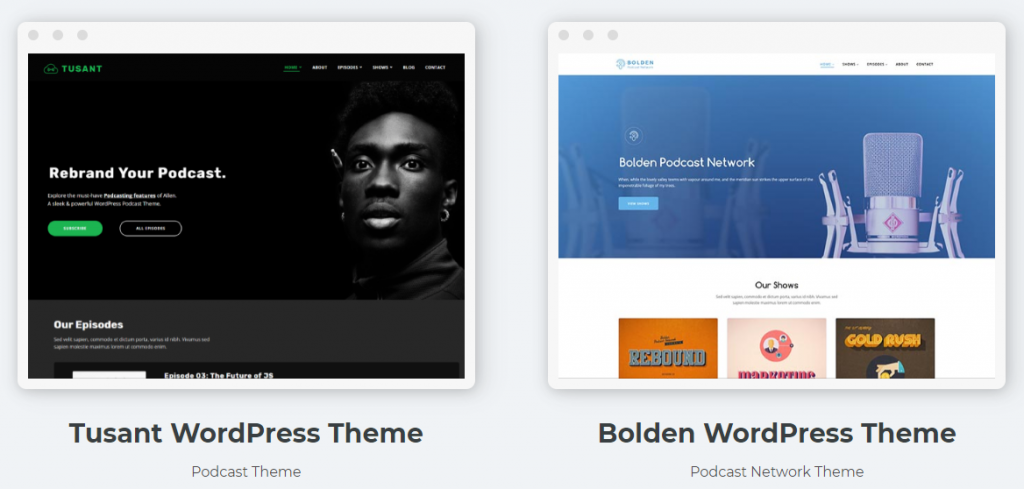
One of the great things about using WordPress is that you have thousands of themes to pick from. There are options for podcasts, musical artists, audiobook publishing, and any other audio medium you can think of.
If you’re serious about your music or podcast, investing in a premium theme can be worthwhile. Popular premium options include many features that make it easier to customize your site. For example, our Tusant podcast theme comes with multiple layouts for displaying your show’s episodes.
2. Edit Error Messages to Reflect Your Brand’s Tone
Error messages on websites are a lot more common than you might realize. Even if your website is set up perfectly, visitors will run into the occasional issue. Users might try to visit pages that don’t exist, run into problems while making a purchase, or even try to leave comments on your episodes without success.
When we encounter something on the web that doesn’t work, our first response tends to be frustration. The goal of an error message should be to explain what the problem is and how to solve it. Take our website – if you try to visit a page that isn’t there, here’s what you’ll see:
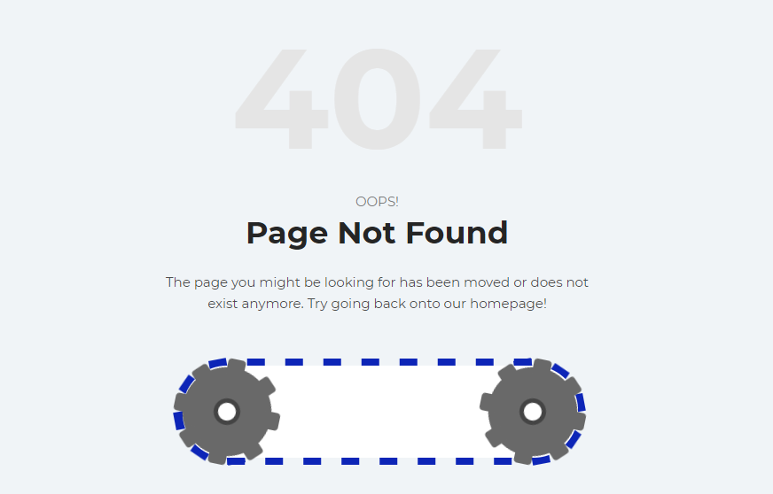
There are plenty of WordPress plugins that enable you to set up custom error pages. You can adjust those pages so that they fit in with your brand’s style and the rest of your website.
The same goes for every other error message that users might run into on your website. If you use a form plugin, you can edit the placeholder text within fields to explain what visitors should do. Error messages that fit with the rest of your page’s design can make your website feel more professional.
3. Make Your Website Easy to Navigate
Websites don’t need to be complicated to be visually engaging. You might feel tempted to go overboard and add plenty of animations, massive menus, pages with complex layouts, and more. However, the easier your site is to navigate, the more likely it is that your audience will enjoy using it.
You can do many things to simplify your website’s navigation. For example, you can start by ensuring that your main menu leads to all of the most critical pages on your site and that every link is easy to access.
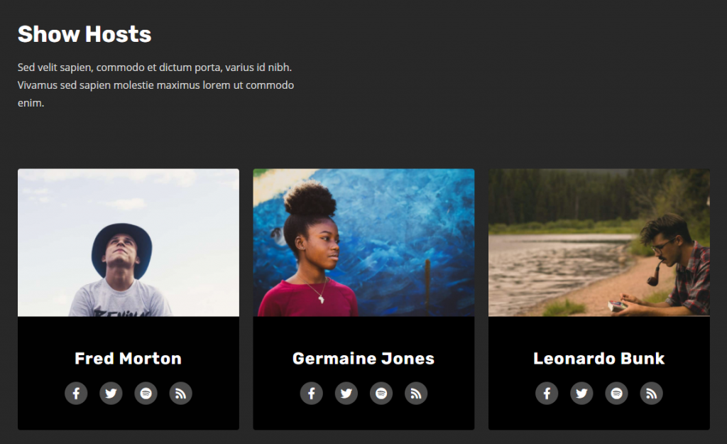
When it comes to page layouts, we recommend keeping things simple and only including elements and information that you need. For example, you might have a section for visitors to get to know your podcast hosts. Here, you can just include links to their social media profiles:
The less clutter in your website’s design, the easier it will be for visitors to find the content they’re looking for. That ease of use translates to spending more time on your site and getting more involved with your brand and audio medium.
Conclusion
If your podcast or music is great, followers will likely come to you. They’ll find you through apps, social media, and word of mouth. However, if you don’t have a website for your audio medium, you’re missing out on a world of opportunities for engaging with that audience.
For the best possible results, your website should be stylish and visually stimulating. Here are some tips to point you in the right direction:
- Choose a theme that matches your audio’s style.
- Edit error messages to reflect your brand’s tone.
- Make your website easy to navigate.
With these strategies, you’ll have your site looking great in no time!